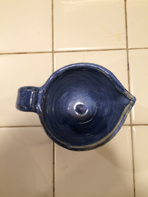
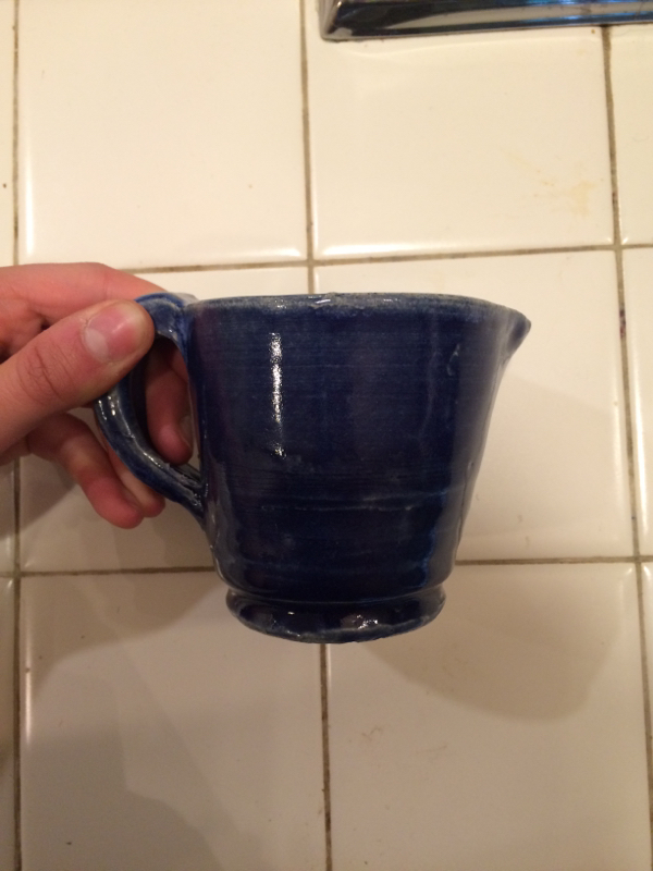
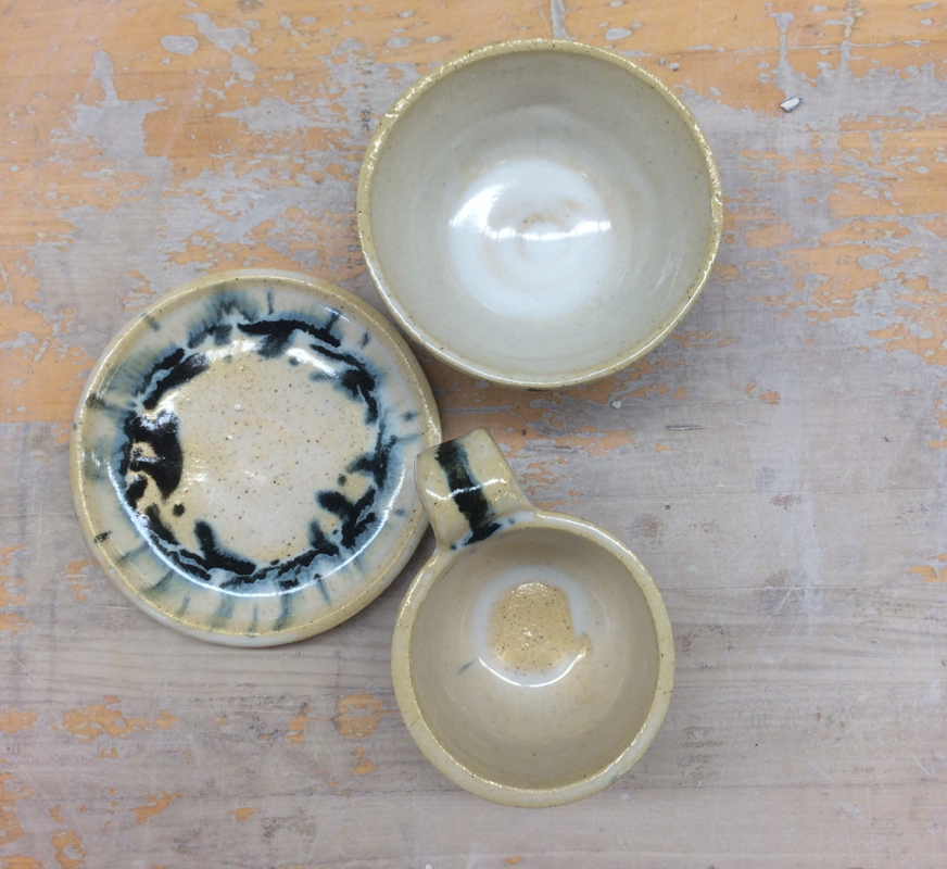
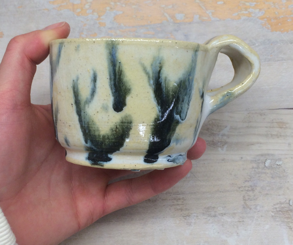
This is my wheel altered project, and the first one I've made. It is a mini pitcher, and I'll most likely end up using it for cream for tea or coffee or something. It's surface is very smooth and the form is round except for the little divet for the spout. The colors I used were dark blue and white, the white to make the inside of the pitcher lighter than the outside. A new skill I learned through this project was how to alter something I made on the wheel, and an art element in this project is value since the shades of blue vary. A design element, however, would be unity because the shades of blue, though different, work together and are cohesive. Because of this, the overall feeling of the project is very collected, polished, and almost serene or calm.
This is my first choice project of the quarter, and is a cute little bowl. The form is very smooth, which I'm very proud of actually, and the shape is round. The colors I used were dark blue and white, and they way the two combined at the top and on the inside created a dimensional light blue. The most present art element, in my opinion, would actually have to be texture, because the thicker glaze on the top of the bowl creates a minor contrast in texture while the project is still overall very smooth, which makes it interesting. I think the overall feeling of the bowl is very serene and calm, due to its whimsical uniformity; which is reflected by the design elements of balance and contrast. This is my set of 3 project, where I had to make three pieces that worked together and had a cohesive theme. The form of all of them is smooth and even, and the color scheme and movement is uniform throughout, even if they have different shapes. The colors I used were black and white, and they ran together. Because of this interesting turnout with the colors, I'd say that color is the most present art element in this project, even though it's not super loud. The most present design element however, is movement. This is because the black and white run together and look free-flowing and dynamic rather than just static. That said, unity and harmony is also present due to the cohesion between all three pieces, but I think that just adds into the overall feeling of uniformity yet creativity throughout the project. This is the third bowl I've made, and the first from quarter 2. Overall the surface is very smooth and the shape is round. The colors I used were white and dark blue. A new skill I learned from this project was how to fix the bottom if you accidentally foot through it, which I did. I would say that color is art element in this project because of the clear distinction between the two, and movement would be a present design element because of how the blue is splattered and the two colors run together. Overall the feeling of this project makes me really happy, because I think it is unique and that the colors turned out well, and I'm just happy with how it came out- so that's the mood it gives off. This is an extra project I made during first quarter, but am just now getting to upload. I made this bowl just for kicks, and the form is pretty smooth but a little bit off center, but still has a round shape and surface. A new skill I learned with this project was how to make an actual bowl, not just a small dish, because prior to this, I hadn't been capable of that. An art element present in this project is value, because the glaze created different shades of the color within it and therefore different shadows and balances of light and dark. Due to this, I'd say a design element for this bowl is color. The overall mood of it is very sleek and interesting since its cool colors are gradient and they vary, which is new and intriguing compared to how our glazes usually look. This is my first plate, which overall is super smooth and on center, which made me really happy. The colors I used were dark blue, turquoise, and white. A new skill I learned through this project was how to make and foot a plate, since I'd never done either before. An art element in this project is color since there's a lot of that, and a design element is movement since the colors are splattered and free-flowing. I would say that the overall mood of the piece is very fun and artsy since the colors don't follow any specific pattern but are still clear and distinguishable. This is my second plate, which also has a very smooth form and round, centered shape. The colors on this one are white and purple, but the glaze didn't turn out quite as I'd hoped. I was hoping for the purple and white to run together, which they didn't. It's still a unique piece though, and through my mistakes with glazing, I acquired the new skill of learnin how to better glaze a plate next time. An art element present in this project is line, since you can see the lines in between and within the colors. A design element would be color, since both colors are very prominent. The overall feeling of this piece to me is unique, since it isn't entirely polished or refined but is still made well and therefore creates a kind of contradictory but still cool feeling. |
AuthorWrite something about yourself. No need to be fancy, just an overview. Archives
June 2015
Categories |