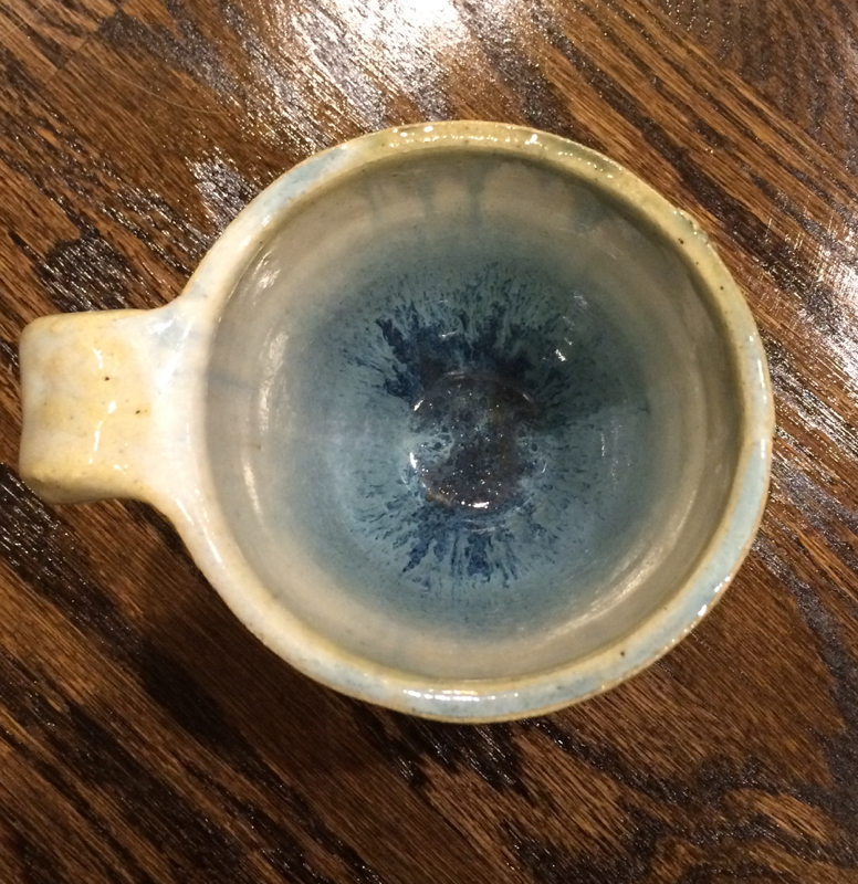
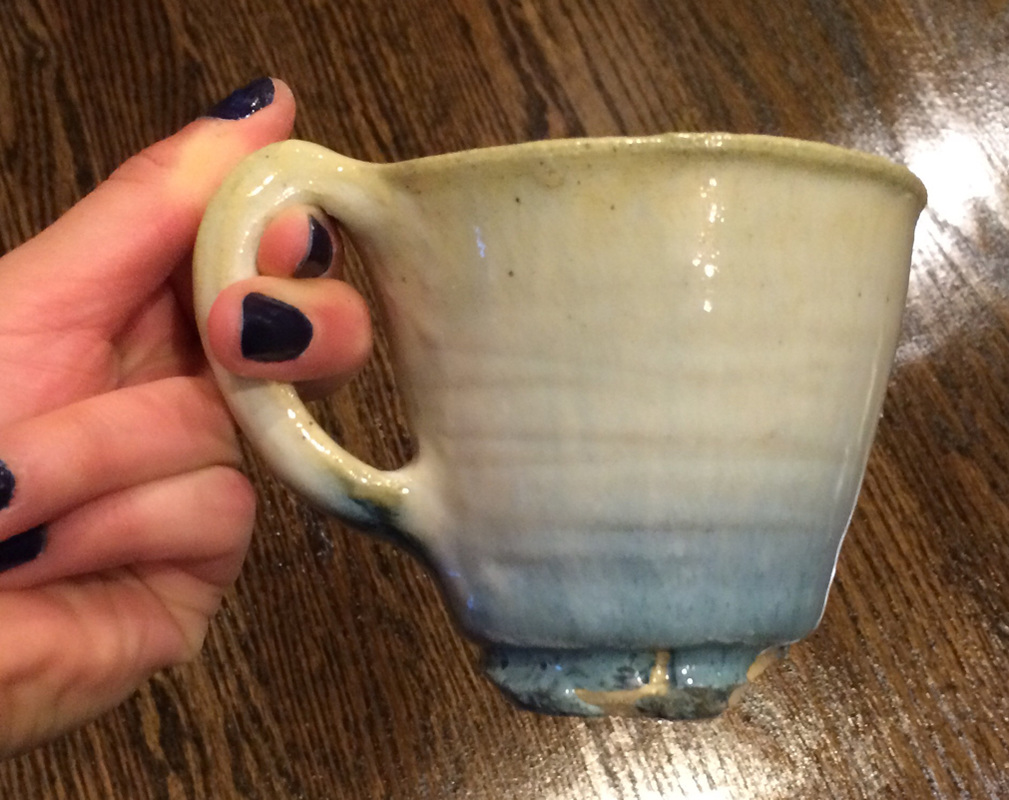
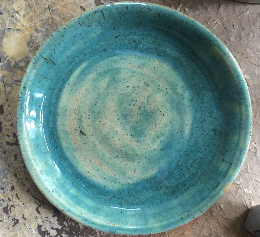
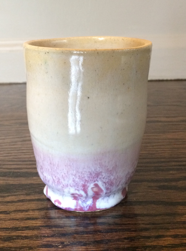
This is an extra project I made, and it's a cup with a pulled handle. The form and surface are very smooth except for the bottom, where the glaze ran too much, stuck to the kiln, and broke off. The colors I used were a blue that was unlabeled, and white. An art element in this project is color because of how they run together, and for the same reason, a design element would be movement. The overall feeling of the project (besides the broken part) is smooth, polished, and serene.
This is the fourth bowl I've made, and it is by far the most interesting. It has a very round form but a very textured surface. The color on the outside is dark blue, and the inside is a mixture of dark blue and white. A skill I learned through making this project was how to successfully make a bigger bowl without making it too thin. An art element in this project would be texture, because of the way the glaze created droplets rather than being completely smooth. A design element, however, would be contrast, due to the contrasting smooth and textured surfaces on the bowl. Overall, I'd say the feeling of the bowl is very unique given its swirly and cool interior, and different and textured exterior. I couldn't figure out what to do for my second choice project, so I asked my mom what she wanted; and she said a coaster or little plate. So, that's exactly what I made. It's surface is very uniform and smooth, as is its form. The color I used was shadow green, and I really like the way the glaze turned out. A skill I learned from this project was how to use a small piece of clay to make a plate without it getting too thin. An art element present in this project would be texture since the whole project is very smooth, and a design element would be color since there is only one, very prominent color. That one prominent color, green, however, also has little brown/gold flecks that add to the feeling of the plate, making it feel generally unique while still being finished and refined. This is my tall project that I made, and it has a very fluid-looking surface, and a rounded/smooth form. The colors I used in this project were pink and white, and I did the glaze in a way that would cause them to run together. A skill I really honed in on through this project was how to pull up smoothly and maintain being on center even with a tall project. An art element in this project would be value because the colors are gradient and therefore have different values throughout the piece. Because of this, the most prominent design elements to me are color and movement. This fluidity and pale colors give a very elegant and bohemian yet polished feeling. |
AuthorWrite something about yourself. No need to be fancy, just an overview. Archives
June 2015
Categories |