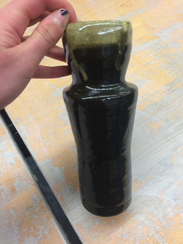
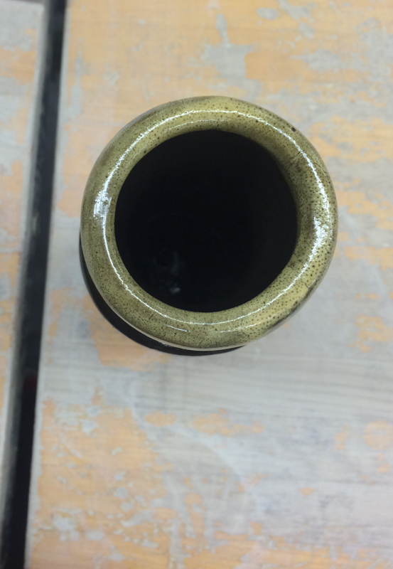
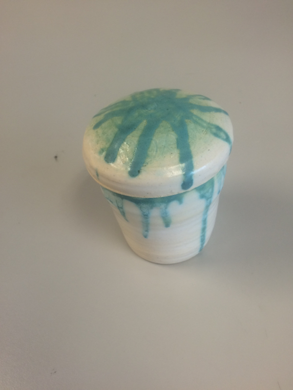
This is my frankenpot project that I made with Carl. He made the base and middle, and I made the top. Originally, the top was suppose to be small at the bottom and fan out into a lip at the top, but it fit better and has a more unique shape if we used the wider fanned part as the base of the top- so we did. The form is smooth, because the glaze was thick and the pot itself was fairly even. The colors I used were black with a white ring around the top, which dripped in a few places. A new skill I learned through this project was how to make a collaboratory project with someone else, which was a new and fun experience. An art element in this project is contrast because there is a distinct difference between the black and white colors. I think this project gives off the overall feeling of being unique due to its shape, but still clean and polished, as the glaze and overall pot is very uniform. The design element of color emphasizes the top of the pot which draws attention to its shape as a whole, and adds to the unique feeling of it all.
This is the lidded project I made during quarter one. The lid and base got separated for awhile so I wasn't able to put them in the grade book, but now I can. The surface is a little uneven because it was off center while I was making it, but overall it is pretty even and the two forms still fit together. The colors I used were the turquoise color and white. A new skill I learned is how to make a project that has a lid, I didn't know how to do that and make it work until I did this project. An art element in this is space because the space it takes up changes depending on if the lid is on or not. I'd say the overall mood or feeling this project gives off is fun, because it has a lot of movement (my design element for the project) and the colors are bright and happy. Since I was still working on bowls, I chose to do another one as my choice project. The form is overall round and smooth, though a little off center, and the surface is smooth since the glaze was thick enough. The colors I used were italian straw and shadow green, with the green on the inside with the effect of "dripping" down the outside. A new skill I learned through this project was how to get the entirety of the inside of a bowl to be a different color than the outside. An art element in this project is space, since the inside spilling over to the outside gives a different idea of space than a project that had a clear barrier between the inside and outside. I think this project gives off the overall feeling of being unique but still clean and polished, especially through the use of the design element of movement, which shows through the green "dripping" on the sides. This project was my second bowl, but it's very small. The form is smooth overall, and the surface is a bit varied since the glaze is thicker in some places than others. The colors are white and pink, and also the normal color of the fired clay since the white wasn't very thick in some places. A new skill I learned through this project was how to successfully pull out a bowl with the rib tool while keeping it on center, since this is the first project where I did that. An art element in this project is color since that is different in different places on the bowl. The overall feeling is original and something kind of new and special, since the colors didnt mesh with the same unity or harmony that they usually might. This is my cylinder/tall project, the first thing I successfully made on the wheel. The form and surface are completely smooth, there's no rough or different texture, it's all uniform. The color, however, is not entirely uniform. I glazed the outside with white, so it's the same color of the fired clay, and the inside is a kind of gradient blue. The skill I learned through this project was simply how to create a completelt centered project. An art element used was color, since there was varied and gradient colors. The mood or feeling I get from this project is very clean and polished, and mild, since it is not loud or overstated. I think this mood is created by having the contrast of colors, while not being too loud. |
AuthorWrite something about yourself. No need to be fancy, just an overview. Archives
June 2015
Categories |